Redesigning Header Navigation

Redesigning Header Navigation

Redesigning Header Navigation

Platform - The Dapp List

Project Duration
1.2 Weeks
My Role
Sole Product Designer
Tools
Figma, Linear, Notion

Project Goal

Project Goal

Project Goal

Design a consistent, intuitive, and gamified header experience to enhance navigation, increase search usage, and boost user participation.

Design a consistent, intuitive, and gamified header experience to enhance navigation, increase search usage, and boost user participation.

Design a consistent, intuitive, and gamified header experience to enhance navigation, increase search usage, and boost user participation.

Understanding the Problem

Understanding the Problem

Understanding the Problem

The header plays a critical role in navigation, discovery, and engagement. However, the original header on The Dapp List created friction in multiple ways:

  1. No access to key filters like chains and categories

  2. No gamification callout — users had no incentive or reminder to earn points

  3. Inconsistent layout and color use broke visual flow and trust

These issues not only compromised usability but also resulted in missed engagement opportunities.

Old Header Screenshot

Major Challenges

Major Challenges

Major Challenges

-> Navigation Pain: Users had to click multiple times to access filters like chains or categories — delaying discovery.

-> Gamification Hooks: Even though users could earn points, this wasn’t surfaced in the header UI.

-> Search Was Ignored: The header lacked a visual system, leading to inconsistencies across views and devices.

-> Design Debt: The header lacked a visual system, leading to inconsistencies across views and devices.

Design

Design

Design

Things that I improved

Things that I improved

Things that I improved

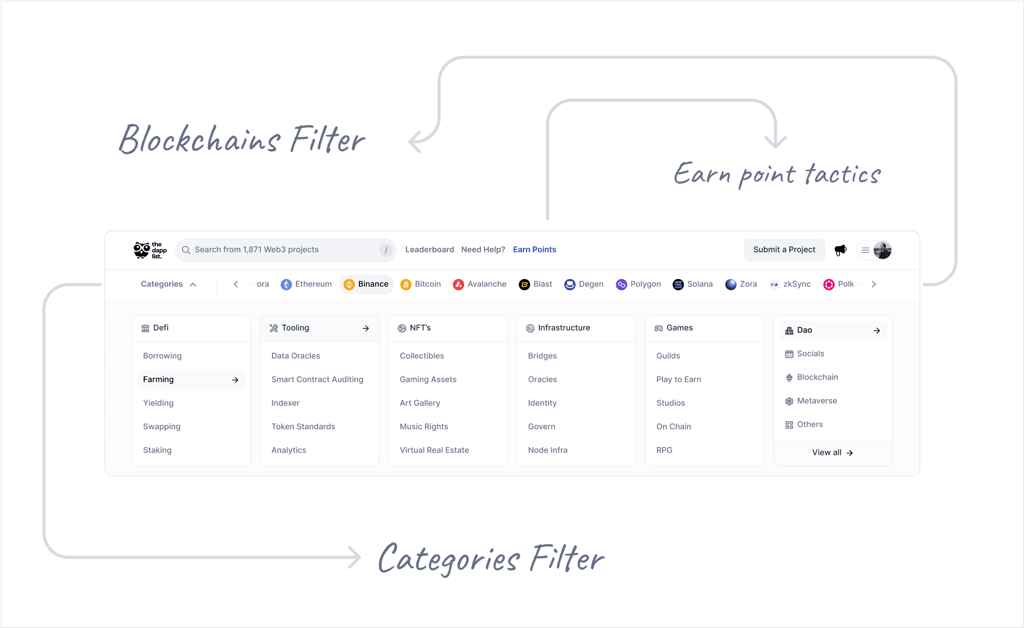
Introduced Blockchain Filters

I added horizontal scrollable chain filter in the header.This made switching between chains (like Ethereum, Polygon, Solana) seamless and contextual.

Category Navigation with Sub-Filters

Users can now explore DeFi, NFTs, Gaming, and more — with dropdown access to specific subcategories like “Borrowing” or “Staking” under DeFi.

Search Enhancement

The new search is left-aligned, prominent, and styled with better spacing, icon clarity, and auto-focus.This change increased visibility and gives search its rightful weight as a core feature.

Gamification Hook: Earn Points Callout

Added a visible “Earn Points” link in navigation. Clicking it takes users to ways to explore page and level up their game.

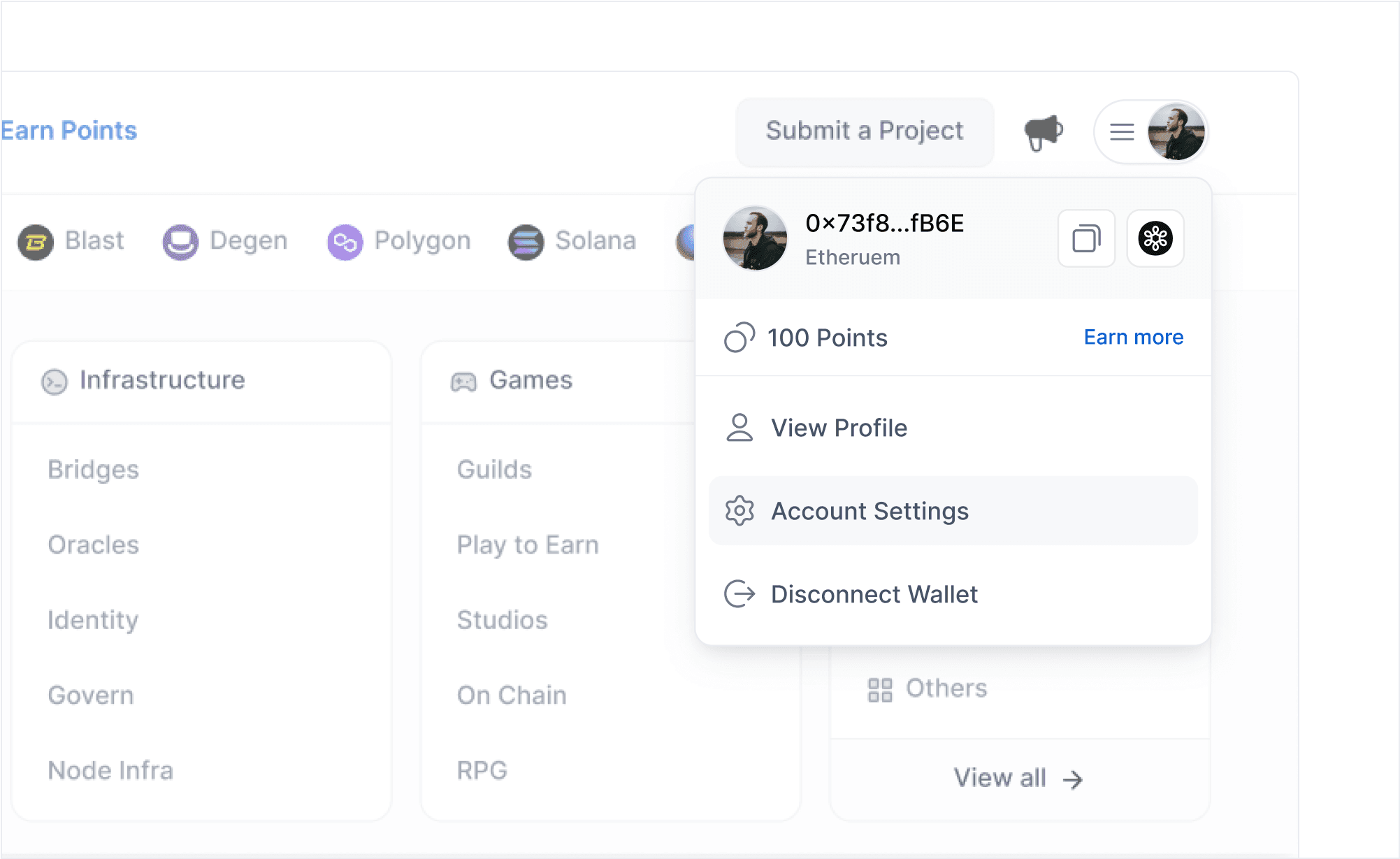
Redesigned User Dropdown

The old user dropdown was cluttered and underutilized — missing an opportunity to guide returning users.

Learnings

Learnings

Learnings

  1. Jakob’s Law: Users expect familiar navigation patterns.Borrowing the Airbnb filter style reduced learning curve drastically.

  2. Fitts’s Law: Making interactive elements easier to reach increases interaction. By repositioning the search bar and filters, I brought them closer to where attention lives.

  3. Small Touches Build Trust: A consistent header experience helps create an emotional baseline of “this platform is polished and reliable.”

Want to get in touch? I'd love to connect with you!

Want to get in touch? I'd love to connect with you!

Want to get in touch? I'd love to connect with you!